


Txwes.edu gets mobile makeover
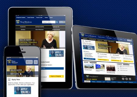
If you are reading this on your iPhone, iPad or Android device, it's easy to see why ComScore predicted that 2014 would be the first time that more Americans would use mobile devices to browse the Web than they would desktop computers.
Texas Wesleyan's mobile Web traffic grew an average of 3.2 percent during the last four years and represents 27 percent of our visitors. In response to the growing population of tablet and mobile phone visitors, a new, responsive version of Txwes.edu will be available Aug. 13.
What is responsive design?
Having a responsive website means that all users, whether browsing the internet on a phone, tablet, laptop or desktop, are able to view content in a way that optimizes their experience.
The home page, as well as the Admissions and Aid, News and Events and Emergency Alerts sections, will be the first to launch with the new code, and plans are underway to bring the remaining sections of the website into the responsive development.
Academic and department sites will be developed next, including a planned upgrade to the architecture and visual design to unify the experience for visitors.
A unique development
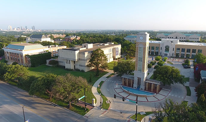
The Texas Wesleyan will be one of only four higher education institutions in DFW (UTA, University of Dallas and DCCCD) with a mobile website.
One reason mobile websites are less common than traditional websites is the underlying technology involved with developing a single solution that works on multiple devices, browsers and screen resolutions.
"University Web traffic research determined the devices and browsers we were developing,” said Neal Cornett, director of Web Services, “We wanted a solution that gracefully worked on whatever system visitors use to browse our website."
This code replaces the existing website but utilizes the same design and content, so you won't see a change if you view the site from your desktop or laptop.
Additionally, the responsive Web design benefits campus content contributors because all changes, including the addition of news and event items, are automatically optimized for mobile viewers.
For questions or feedback about the mobile website, please contact Neal Cornett at jncornett@txwes.edu.